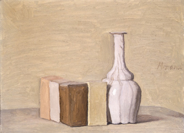
Still Life, 12 x 16 inches, oil on canvas 1955, by Giorgio Morandi. National Gallery of Art, Washington DC
When I saw an article on small painting vs. large painting, I thought immediately of Jon Manteau. I remembered a conversation we had about it when I taped him in his studio, here and here. In the following piece he gives us his unique view on this subject from the perspective of someone who creates paintings as large as 8 x 12 feet. Scroll down for links to other articles and opinions on this topic. Vincent Romaniello
There seems to be a lot of discussion these days about the merits of small-scale art verses large scale works. I find the subject to be annoying and ultimately a waste of time. For me, this dialog is akin to politico's using race as a divisive issue. It's tired!!! This is not to say that race, racial equality or racism are dead issues, on the contrary, humanity’s capacity for hate and genocide will in all likelihood never entirely disappear. Our history is rife with it! The analogy that I'm attempting to make is, large-small, black-white, hetero-homo, blue states-red states, you-me, us-them, apples-oranges, etc, etc. On many levels, this dialog is counter-productive and when used to divide or to polarize it can become a slippery slope. Enough with the soapbox preaching for now, it's Election Day, so back off.
Small verses large, does it really matter, as long as the work gets the idea or message across to the audience in the most effective possible way? Smaller works have traditionally functioned as studies, sketches, vignettes or windows. Like looking through a viewfinder or peephole. When I think about the effectiveness of smaller works and their ability to draw one in, Johannes Vermeer immediately comes to mind. I think that when one views a Vermeer painting, we are observers, voyeurs. We are allowed to view what he has chosen for us to see but we are definitely not participants in his landscape. We are just onlookers.

Johannes Vermeer, Woman Playing a Lute near a Window, after 1664, oil on panel, 20.25 x 18 inches, Metropolitan Museum of Art.
I find that something very different occurs when the scale of a painting increases. It’s the “macro” (large, inclusive), as opposed to the “micro” (very small). The viewer becomes part of the landscape. Color and iconography surround, envelope or wrap around the viewer. I'm not attempting to diminish the importance of either small or large. They just function in different ways. Would Picasso’s “Guernica” be as powerful if it were 12 x 27 inches as opposed to its monumental size of 12 x 27 feet? Would Michelangelo's Sistine Chapel ceiling make the same statement if it were the size of a postage stamp? By the same token, would a Giorgio Morandi still life make any sense at all if it were 8 x12 feet?

Guernica, by Pablo Picasso, 12 x 27 feet,
oil on canvas, 1939, Museo Reina Sofia, Madrid.
Back to the future, does a Julie Mehretu large scale piece have the same intent as does one of her smaller works? The point is this, it's all about intent. It shouldn't matter whether a work is large or small as long as it serves the artist's cause. We can debate the merits of "large just for large" in a sensationalist, market driven, environment just as we can debate "small for small" because everyone can own one. Art as spectacle is very different than art with serious gravitas. Bigger isn't better, if it ain't better. Small isn't better, if it's mediocre or lacks ambition. Sometimes less is more, but sometimes less is just less.
– artist, educator, Jon Manteau

Empirical Construction, 2003, acrylic and ink on canvas, 9'8" x 14'7", by Julie Mehretu.
Is Painting Small the Next Big Thing? Roberta Smith, NY Times.
Response Blue Vertical Studio
Small talk with Roberta Smith Two Coats of Paint

